Analyzing and Visualizing Data
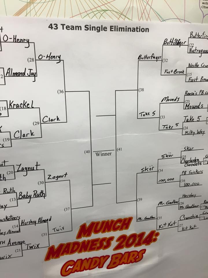
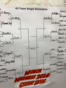
What is the best candy bar on the market? For one of our creative teacher’s lounge lunchtime activities this year, my colleagues and I designed and carried out a “Munch Madness” bracket for candy bars. Although we considered it a bit of a silly leisure activity, it required a vast array of collaborative skills, planning, and critical thinking. We had to tackle a lot of difficult questions:
- How do we find out what candy bars are on the market?
- How can we collect the data while doing our grocery shopping?
- What counts as a candy bar?
- How can we design a bracket that is fair?
We had a lot of fun. Each match-up was decided by a taste test and votes from participants. Here are the final four (if you register for Guiding Students in Gathering and Visualizing Data you can find out which candy bar won):
This activity is a great representation of the kinds of activities included and promoted in Guiding Students in Gathering and Visualizing Data.
As well, I will introduce participants to the design and development of info-graphics with students, guiding students in the use of IFTTT to gather information automatically, and the uses of Google Drive in collecting and visualizing data.
Throughout it all, we’ll inject fun and creativity, allowing students to make choices about their tasks, and connecting their learning to their everyday lives.
Guiding Students in Gathering and Visualizing Data is intended for K-12 teachers of all subjects, and requires access to a Google Drive account.
What do you think of the results of our (much simpler) Girl Scout cookies bracket?